Colour Psychology in Branding
In the vibrant realm of branding and design, colour transcends mere aesthetics—it becomes a powerful language that articulates a brand's essence and personality. With research showing that up to 90% of snap judgments about products can be based on colour alone, selecting the right colour for your brand has never been more important.
Delving into the intricacies of colour psychology unveils a realm of possibilities, enabling brands to weave narratives that deeply resonate with their audience. Colour wields immense influence across diverse sectors such as branding, fashion, and interior decor, possessing the remarkable ability to evoke emotions and shape perceptions. Each hue evokes a unique emotional and psychological response, underscoring the significance of understanding their meanings when crafting a brand's colour palette. This comprehension allows us to infuse our brand with desired emotions and personality traits—a crucial facet of effective branding.
In visual strategy and brand design, colour assumes a central role. Whether selecting imagery for a brand photoshoot, developing a brand identity, or undertaking any creative endeavour, a comprehensive understanding of colour theory and psychology proves indispensable. It empowers us to make informed choices, ensuring that every visual element harmonises seamlessly with the brand's identity and elicits the intended response from the audience.
Colour Symbolism
Oscar Wilde once said, "Mere colour… can speak to the soul in a thousand different ways." Mastering colour psychology offers invaluable insights in order to craft a spectrum of hues, shades, and tones into craft impactful palettes. Below, we explore the symbolic meanings of various colours, the emotions they evoke, and the brands or industries they complement effortlessly.
White
A Canvas of Endless Possibilities
Often regarded as a symbol of purity and simplicity, white presents an expansive canvas brimming with potential. Its innate minimalism poses both a challenge and an invitation for brands, prompting them to explore texture, layering, and luminosity. Within branding, white emerges as an emblem of freshness, new chapters, and lucidity, rendering it an optimal choice for brands aspiring to embody a sleek, contemporary, and polished identity.
Brand Examples
Apple
Its minimalist design ethos utilises white to signify simplicity and innovation, captivating audiences with its sleek products.
-
Black
A Beacon of Power and Elegance
Black, the epitome of power and elegance, exudes authority, rendering it an impeccable choice for fashion, editorial, and luxury brands. Its sleek and timeless allure effortlessly evokes sophistication and luxury, while its versatile nature allows it to embody mystery or even solemnity. In branding, black symbolises exclusivity, premium quality, and confidence, serving as a beacon for brands striving for a distinguished identity.
Brand Examples
Chanel
Its iconic use of black, epitomises sophistication and timeless elegance, setting the standard for luxury fashion.
-
Pink
Dancing Between Playful Innocence and Vibrant Energy
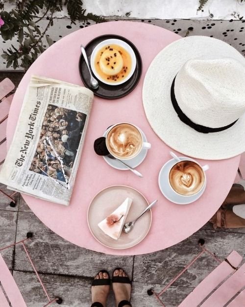
A studio favourite, pink embodies a blend of softness and strength, ranging from delicate pastels to bold magentas, evoking romance, femininity, and optimism. Its versatility in branding spans from youthful exuberance to refined luxury, captivating audiences with warmth and approachability. Despite being pigeonholed as "girly," the stereotype is fading as brands embrace pink's potential. In colour psychology, it signifies playfulness and fun, with shades like magenta standing out vibrantly.
Brand Examples
Glossier
Renowned for its fresh, modern take on beauty, Glossier embraces its signature pink hue, symbolising playful femininity and a community-driven ethos in cosmetics.
-
Yellow
Radiating vibrance, warmth and optimism
Embodying optimism, energy, and lucidity, in branding, it commands attention and fosters sentiments of joy, creativity, positivity and spontaneity. With its close association with the sun, yellow symbolises hope, renewal, and vitality. Brands employing yellow seek to convey a welcoming, accessible, and youthful demeanour. Whether as a dominant hue or a complementary accent, yellow enlivens a brand's persona, leaving a lasting impression and ensuring instant recognition.
Brand Examples
Bumble
First known as a dating app, the company has broadened its scope to include networking and friendship; its vibrant yellow branding embodies positivity, empowerment, and the courage to take the initiative.
-
Green
synonymous with nature, growth, freshness and rejuvenation
Green radiates tranquillity, vitality, and well-being, making it a versatile choice in branding. It symbolises sustainability, health, and balance, resonating with brands advocating eco-friendliness, organic origins, or holistic approaches. Green's association with the natural world fosters trust and stability, helping businesses establish authenticity and reliability.
Brand Examples
Spotify
This energetic green is not just a design choice; it’s a reflection of the brand’s commitment to innovation, its youthful spirit, and its dynamic approach to music streaming.
-
Red
signifies confidence, boldness, and determination
Red is a dynamic colour in branding, evoking passion, urgency, and vitality. Its dual nature, associated with both positive traits like excitement and desire, and negative aspects like danger and anger, makes it a versatile tool for grabbing attention and prompting action. Across cultures, red holds diverse meanings, from luck and celebration in China to warning signals in the West; all of which can be used to your advantage.
Brand Examples
Louboutin
The iconic red colour not only epitomises luxury and glamour but also symbolises empowerment and confidence, leaving an indelible mark on fashion and culture.
-
Purple
Bridging Royalty with the Ethereal
Purple, historically linked with royalty and mysticism, represents a harmonious blend of the stability of blue and the passion of red. Its richness evokes sentiments of luxury, creativity, and spirituality, making it a standout choice in branding for conveying innovation, elegance, and the ethereal.
Brand Examples
Liberty London
a prestigious British brand renowned for its opulent ambience is the epitome of luxury and heritage. The brand's choice of purple underscores its status among London's most extravagant department stores, conveying innovation, elegance, and a sense of wonder.
-
Blue
symbolises loyalty, stability, tranquillity, and calmness
Blue, ranging from teal to navy to indigo and beyond, evokes varied perceptions depending on its shade. Widely employed in corporate logos, particularly in the tech industry, blue symbolises loyalty, stability, tranquillity, and calmness, reminiscent of the sea and sky. Its popularity among corporations may stem from these positive associations, with dark blue even deemed the most relaxing colour globally.
Brand Examples
Visa
Its dark blue branding communicates trustworthiness, reliability and security to its customers, instilling a sense of confidence and stability.
Crafting Memorable Experiences
Understanding the intricate nuances of colour psychology enables brands to forge deeper connections with their audience, creating experiences that resonate long after the initial interaction. By harnessing the transformative power of colour in branding and design, businesses can weave narratives that captivate, inspire, and leave an indelible mark on consumers' hearts and minds.
In essence, the colours a brand chooses play a significant role in shaping its identity and perception. Through thoughtful consideration of colour theory and psychology, brands can leverage the full potential of colour to create impactful visual identities that resonate with their audience and leave a lasting impression.
For further exploration of colour and its significance, we recommend reading "The Secret Lives of Colour" by Kassia St Clair. This captivating study delves into the origins and cultural significance of various colours, offering fascinating insights into the role of colour in human civilisation across fashion, politics, art, and beyond.
Want to know more about our branding process? Say hello, we don’t bite.
Don’t know where to start picking colours? First, look back to your positioning - what is brand personality? Visualising personality traits will instantly bring colours to your mind. Optimistic? Start with some brights. Exclusive? Let’s go monochrome. Haven’t done a brand positioning? Well, give this a read first!


